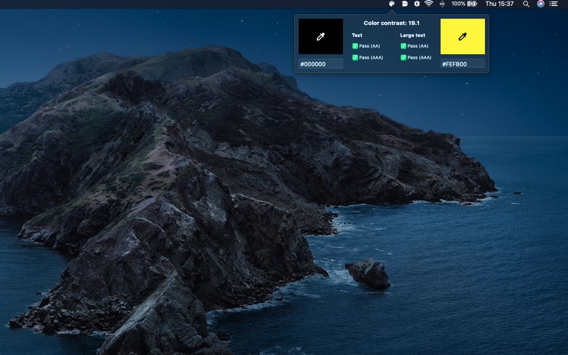
Color Contrast Desktop
macOS / Utilitaires
Color Contrast is a tool to measure the contrast between two colors in a screenshot or mobile website, helping ensure your app meets the internationally recognized recommendations in the Web Content Accessibility Guidelines (WCAG) 2.1
Color Contrast has the following features:
+ Verify that the color contrast between two colors in an app, website or photo is sufficient to pass WCAG 2.1 accessibility guidelines / Section 508.
About WCAG 2.1
WCAG 2.1 accessibility guidelines have three levels of compliance, A, AA and AAA. When considering large text (i.e. text which is above 18pt or larger), the minimum AA color contrast ratio is 3:1 and for AAA the ratio is 4.5:1. For normal text, the AA color contrast ratio is 4.5:1 and for AAA the color contrast ratio is 7:1.
For more information about WCAG 2.1 see https://www.w3.org/TR/WCAG21/


