Contrast — Color Accessibility
macOS / Graphisme et design
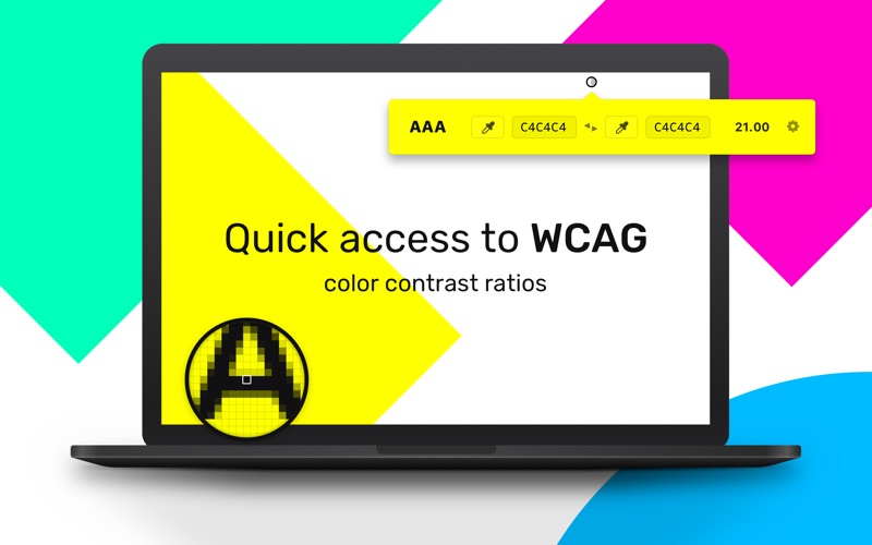
Make sure the text you're designing isn't too light in your interface designs with Contrast. Combine this simple little menu bar app with your favorite design tool and design with accessibility in mind.
Enter hex codes manually or use the built in color picker for sampling colors directly from your designs.
Tear the app from the menu bar and use it as a floating window wherever you'd like. It'll stay on top of your active design tool for quick access to the WCAG contrast scores.
Quoi de neuf dans la dernière version ?
Update our data privacy. Before we had some analytics to anonymously track how many times Contrast was opened just because we were curious. We never did anything with this data and haven't looked at it in years. Some asked why there was some tracking, so we decided to just remove it altogether. Now, Contrast doesn't collect any information. In fact, Contrast can't even connect to the Internet anymore. Enjoy!